This is not the first time the office has changed, and it likely won’t be the last. Physical office design has had to remain adaptable for decades, adjusting to support the needs of the workforce at the time.
“There’s a historical assumption that has existed for centuries: People need to go to work to do their jobs,” explains Jonathan Merin, Corporate and Commercial Studio Lead at design firm SMMA. “Now we have to ask ourselves new questions: What if the assumptions are no longer true? How do you look at these situations on a case-by-case basis as a design problem? Why is it that we are bringing people together, and how does it influence the ways we think about the workplace?”
Thus, in order to better understand the office requirements of today, it’s important to reflect on where the office has been. Let’s take a deep-dive into the evolution of the office, and how this can prepare us for what we need to know about the workplace of tomorrow.
Lessons from History
The concept of working 9-to-5 used to make a lot of sense, but today, it’s a bit superfluous. Simply put: perceptions have changed. Office spaces are being reconfigured to support a hybrid work force through more flexible, immersive, and engaging environments. However, the office has always changed over time. Below is just a brief recap of the many looks and feels of office design throughout the decades:
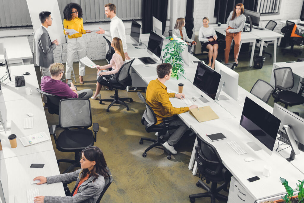
- In the 50s, office plans were open; some might even say that they evoked factory floors. This setup allowed managers to ensure productivity by having their employees visible at all times. Higher ranking employees had access to private offices and windows, which served as a status symbol and created a clear hierarchy.
- In the 60s, Robert Propst created the “action” office, which was an early predecessor of the cubicle. It had three walls, and allowed for employees to have more privacy while still being open for collaboration if needed. The cubicle continued to be popular throughout the 70s as well, which also saw the introduction of computers and other basic office equipment.
- Corporate culture grew dominant in the 80s, meaning that workplace design adopted more modern elements. Glass and concrete created cleaner lines of vision throughout the space, and workstations grew heavier and more cluttered as computers entered the mass market and offices needed the means to equip them.
- In the 90s, the workplace was purely utilitarian and functional. This meant that open offices began to re-promote their collaboration benefits (a message that contrasted with the open office concept seen in the 50s).
- Office trends in the early 2000s saw the invention of “coworking” spaces. These types of floor plans allowed people who were either independent contractors or employed by different companies to work in a shared setting. Coworking models sought to encourage interaction with like-minded individuals, share communal resources, and thus fuel innovation.
- The coworking trend continued in the 2010s, with companies like WeWork taking the stage and setting a new precedent for the workplace. At the same time, other large companies such as Apple and Google began focusing on office designs that promoted sustainability, wellness, and community.
Modern Office Design
In today’s world, the concept of coworking — though initially promising for its focus on collaboration and community — temporarily fell out of favor due to bad press that WeWork was receiving and the onset of the COVID-19 pandemic. The pandemic quickly proved to be a monumental industry disruptor, causing many CRE leaders to worry about the future of the office as the workforce transitioned effectively to remote and hybrid work models. Over time, it became clear that many people were hesitant to return to office buildings.
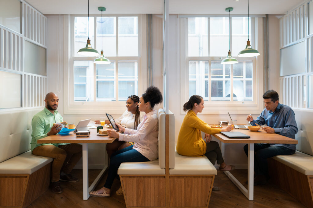
While many experts believe that remote work models are not sustainable, landlords and property teams are finding value in repurposing their office space to provide in-person collaboration, socialization, and community. The modern office will not only need to be highly tech-enabled, but also serve as a social anchor to encourage in-person mentoring, learning, and support group collaboration.
In some cases, different spaces throughout the floor plan might even serve different purposes. An example of this would be attributing distinct purposes to certain areas on a given floor — i.e. some landlords or tenants may want to separate dedicated office space from additional flex space outside of the tenant suite, creating shared amenities that the whole building or community can leverage.
Real-World Applications
Regardless of what the goal is, there are many different ways to achieve a more hybrid, flexible workplace. As architecture firms and interior design teams deliberate on what works best, here are some solutions that have helped tenants and their employees so far:
- Rearranging furniture and reducing desk space to create collaboration “pods”
- Incorporating bright colors to stimulate creativity
- Using more hygienic fabrics and natural materials to increase office sanitation
- Transforming private office space into quiet work rooms that are accessible to all employees
- Creating a more welcoming environment to reduce stress with soft and inviting components like couch cushions, chairs, and natural color palettes
- Leveraging biophilic design to bring nature into the office to increase employee health, happiness, and even concentration (think plants, water, and sunlight)
- Aiding employees looking for collaboration spaces, building resources, and amenities by implementing clear wayfinding throughout the office, be it through furniture placement or notable signage
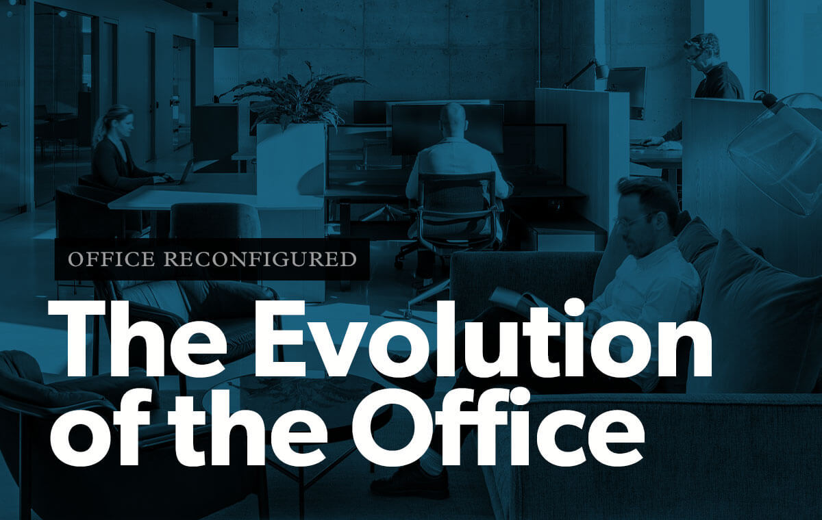
Solutions like these provide choice and diversity to a workforce looking for more personal, custom experiences — but they’re only the tip of the iceberg. For more information on how you can create a more modern, collaborative workplace, download our latest industry guide: Office Reconfigured: How the workplace is adapting to the social and technological needs of the workforce.


